Mobile reading costs time, attention, understanding and action
You may have heard that social scientists recently added a new item on Maslow’s hierarchy of needs.

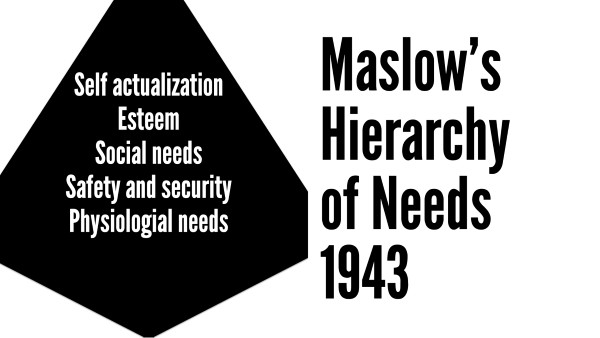
The classic model of what drives human nature looked like this back in the day:

- Self actualization: the feeling of doing what you were put on this planet to do
- Esteem: feeling good about yourself and what you do
- Social needs: having love, a tribe, companionship
- Safety and security: not being afraid of getting eaten by a tiger
- Physiological needs: food and shelter
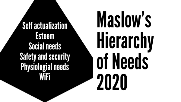
Our modern world has revealed another, even more basic human need …

… Wi-Fi.
No kidding! And where’s juice? A charger? These are things we need to live through the day!
Mobile has become central to our readers’ daily life. And that’s a problem. Because it’s a lot harder to reach readers on a phone screen than it is to reach them on a laptop or desktop.
When your web visitors are reading on mobile, they:
1. Devote less attention to your message
Readers pay less attention to your page when they’re on their phone screens than their laptops or desktops. That’s because mobile web visitors are likely to get interrupted at any moment.
- They’re cooling their heels with your blog post at the doctor’s office — when their name is called.
- They’re looking at your Facebook status updates in line at the grocery — when it’s their turn to step up to the cash register.
- They’re researching the date of your webinar on the streetcar when they notice it’s their stop. Not only do they forget the date, but they also forget the fact that you’re having a webinar in the first place.
As a result of all of those interruptions, readers also …
2. Spend less time with your message
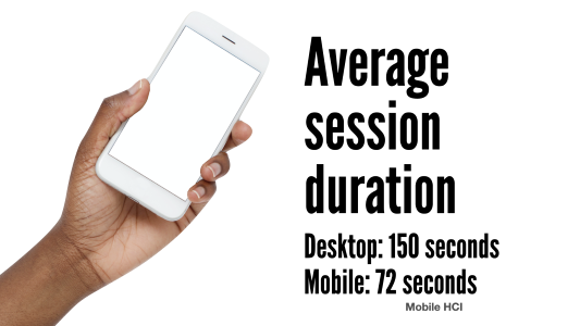
People spend an average of 150 seconds on a web page visit on their desktops, but only 72 seconds on their phones, according to Mobile HCI.

Which means that attention spans on mobile devices are half as long as on desktops.
Plus, the average time people spend on a page is going down:
- Average time on screen 2004: 150 seconds
- 2012: 75 seconds
- 2023: 47 seconds
Which means attention spans are down 69% in 19 years.
3. Read more slowly
People read 20% to 30% slower online, according to a survey of nearly 30 years of research by Andrew Dillon, Ph.D., of the University of Texas.
Reading on mobile takes even longer, writes Kate Meyer, a user experience specialist for Nielsen Norman Group. People spend about 30 milliseconds more per word when reading on a phone than when reading on a laptop or desktop computer.
Let’s do the math: If readers spend less time and read more slowly, they’re absorbing less of your message.
4. Understand less of your message
Mobile web visitors also comprehend less of your message.
Web pages are 48% harder to understand on an iPhone than on the big screen, according to research by R.I. Singh and colleagues from the University of Alberta. In the study, web visitors understood:
- 39% of what they read on a desktop screen
- Just 19% of what they read on mobile screens
5. Remember less of your message
Short-term memory is bad and getting worse. (I looked up a short-term-memory loss joke for this spot this morning, but I can’t remember what it was.)
Problem is, we can only remember what we can see. With a 3-by-9-inch screen, we can’t see very much. In fact, content displayed above the fold on a 30-inch monitor requires five screens on a smartphone, according to the authors of User Experience for Mobile Applications and Websites.
Reading your web page on a smartphone is like reading War and Peace through a keyhole.
6. Are less likely to act on your message
When the IRS improved its web pages about tax law changes, employee call center accuracy increased by 10%, reports TJ Larkin of Larkin Communications Consulting.
When the bureau printed the exact same web pages and left them in employees’ cubicles, accuracy increased by 42%.
The best way to move readers to act?
Overcome the obstacles of reading on the small screen.
So how do you reach readers online, even when they’re reading on mobile devices? Get to the point faster, organize better, make it easier to read and more skimmable.

Leave a Reply