Improve your fact-to-fluff ratio
Readers are busy. Fluff takes space. Space takes time. So let’s cut the fluff and get on with it.

To cut the fluff, aim for a fact-to-fluff ratio of at least 1:1.
How do you find your ratio?
Pass the yellow highlighter/red pen test.
Try this test:
- Highlight all your abstract claims, ideas and concepts with a yellow highlighter.
- Underline all your concrete evidence — fun facts, juicy details, examples, anecdotes, case studies, statistics and so forth — with a red pen.
What should your copy look like? At least as much red as yellow.
What does most corporate web copy look like? A sea of yellow broken only by the occasional speck of red.
To improve your ratio:
- Increase fact. Add “proof” in the form of hard evidence — statistics, analogies, facts, examples, stories, testimonials — to all your claims.
- Reduce fluff. Cut hyperbole, adjectives, adverbs and other puffy prose. Strip your copy of “marketingese.”
Here’s how:
1. Increase fact.
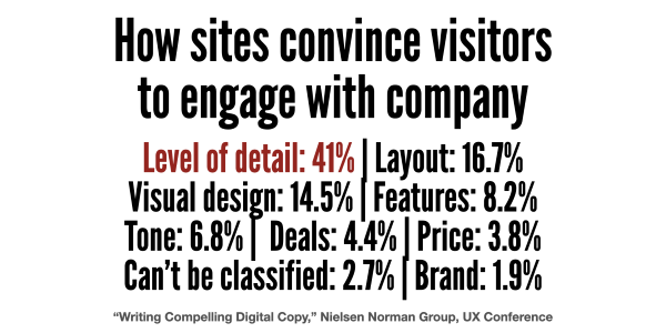
What convinces people to do business with your website? According to research by the Nielsen Norman Group, it’s facts, not fluff:
- Level of detail: 41%
- Layout: 16.7%
- Visual design: 14.5%
- Features: 8.2%
- Tone: 6.8%
- Deals: 4.4%
- Price: 3.8%
- Can’t be classified: 2.7%
- Brand: 1.9%
“Visitors overwhelmingly prefer detail. But they don’t want to be overwhelmed by it,” says Kate Meyer, user experience specialist with Nielsen Norman Group.

If your web page is seriously lacking in the kind of detail that makes visitors want to work with you, increase fact.
Make like a lawyer. Prove your claims. Dig up concrete details — numbers, comparisons, examples and third-party testimonials, for instance — to prove your assertions.
Remember what Texans say about people who are “all hat, no cattle.” Too many pieces of corporate web pages are just that — puffy, overblown chest pounding with little solid evidence to back up the claims.
Don’t let that describe your web page.
2. Reduce fluff.
The second way to improve your fact-to-fluff ratio: Reduce fluff.
Cut hyperbole, adjectives, adverbs and other puffy prose. Strip out “marketingese.”
This promotional language reduces reading, according to Kara Pernice, Kathryn Whitenton and Jakob Nielsen, in How People Read on the Web.
So:
- Cut hyperbole. Minimize modifiers.
- Avoid marketingese and other empty, puffy prose.
- Present information without exaggeration, subjective claims, or boasting.
That’s important.
“The more florid the descriptions, the more users tune them out and go elsewhere. Sadly, the web is so smothered in vaporous content and intangible verbiage that users simply skip over it,” writes Jakob Neilsen, principal, Nielsen Norman Group.
“The more bad writing you push on your users, the more you train them to disregard your message. Useless content doesn’t just annoy people; it’s a leading cause of lost sales.”

Leave a Reply