Hype reduces reading, sharing — even sales
When “king of usability” Jakob Neilsen cut the fluff from a web page about Nebraska, the neutral web page was 27% more useful.

That is, web visitors were 27% more likely to be able to read the neutral version faster, understand it better, remember it longer and enjoy it more.
Online, hyperbole not only reduces usability. It also:
1. Reduces reading.
“Marketese” reduces web page reading, according to Kara Pernice, Kathryn Whitenton and Jakob Nielsen in How People Read on the Web.
“Marketese” reduces web page reading.
— Kara Pernice, Kathryn Whitenton and Jakob Nielsen in How People Read on the Web
Put that web page on a smartphone, and you make matters worse. Although killing time is the No. 1 activity we perform on mobile devices, Neilsen writes, “mobile users are in a hurry and get visibly angry at verbose sites that waste their time.”
Fluff is for pillows, not for web pages Marketing fluff reduces reading online.
2. Slashes SEO.
Cram your web page with adjectives and adverbs, and you’ll reduce your keyword density and along with it your Google juice.
After all, asks Barbara Krause, vice president of corporate communications at Krause Taylor & Associates, how many people would look for “custom designed sports footware” when “running shoes” would suffice?”
3. Decreases sharing.
In The Elements of Style, Strunk and White famously advise: “Write with nouns and verbs, not with adjectives and adverbs.”

Turns out Strunk & White were right, says viral marketing scientist Dan Zarrella.
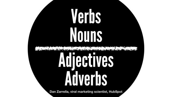
Adjectives and adverbs don’t perform as well on Facebook as nouns and verbs, Zarrella learned by analyzing his Facebook data set to study the relationship between parts of speech and Facebook sharing. Specifically:
- Verbs get shared most often.
- Nouns get shared a little more than average.
- Adjectives get shared a little less often than average.
- Adverbs get shared least often.
Verbs and nouns get shared on Facebook more often than average; adjectives and adverbs get shared less often than average.
— Dan Zarrella, viral marketing scientist
4. Dampens sales.
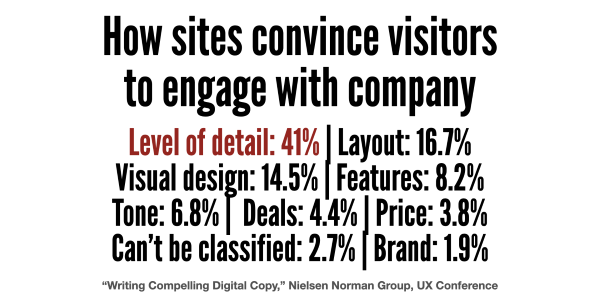
What convinces people to do business with your website? According to research by the Nielsen Norman Group, it’s facts, not fluff:
- Level of detail: 41%
- Layout: 16.7%
- Visual design: 14.5%
- Features: 8.2%
- Tone: 6.8%
- Deals: 4.4%
- Price: 3.8%
- Can’t be classified: 2.7%
- Brand: 1.9%
“Visitors overwhelmingly prefer detail. But they don’t want to be overwhelmed by it,” says Kate Meyer, user experience specialist with Nielsen Norman Group.

They prefer detail, and they eschew fluff.
“The more florid the descriptions, the more users tune them out and go elsewhere. Sadly, the web is so smothered in vaporous content and intangible verbiage that users simply skip over it,” Nielsen writes.
“The more bad writing you push on your users, the more you train them to disregard your message. Useless content doesn’t just annoy people; it’s a leading cause of lost sales.”
“Useless content doesn’t just annoy people; it’s a leading cause of lost sales.”
— Jakob Nielsen, principal, Nielsen Norman Group
5. Cuts usability.
Nielsen is a big believer in neutral language. But when he found that his objective Nebraska rewrite was 27% more usable than the fluffy one, even he was surprised by the ROI.
Neutral language in one study increased web page usability by 27%.
— Jakob Nielsen, principal, Nielsen Norman Group
So he pondered what could be causing the difference. Here’s what he came up with:
“Promotional language imposes a cognitive burden on users who have to spend resources on filtering out the hyperbole to get at the facts.
“When people read a paragraph that starts ‘Nebraska is filled with internationally recognized attractions, ’ their first reaction is ‘no, it’s not,’ and this thought slows them down and distracts them from using the site.”

Leave a Reply