Insights from Poynter’s EyeTrack study
Call it the bailout point.
People reading news on an iPad spent an average of 78.3 seconds on stories that they didn’t finish. That’s according to EyeTrack: Tablet, The Poynter Institute’s latest eyetracking study.
So what’s a writer to do or webmaster to do?
Place a “gold coin” at the bailout point to keep people reading, Poynter researchers suggest. That could be a provocative question, a juicy detail, a plot twist or another element to regain interest.
If people read at an average of 200 words per minute, that means you’d put a gold coin about 250 words in.
Other bailout points to be aware of:
- People spent an average of 98.3 seconds on the first story they read on an iPad.
- People watch videos for an average of 1:15 to 1:30.
Bottom line: Overcome the bailout point.
Give readers a reason to stay.
Here are eight other findings from Eyetrack: Tablet.
1. Design for reading and scanning.
Half of online “readers” actually scan. Same’s true of iPad “readers.” Of the total audience in the EyeTrack: Tablet study:
- 52% scanned
- 48% read methodically
But break out older and younger readers, and those numbers change. The Poynter Institute looked at two different demographics for this study.
Digital natives. These 18- to 28-year-olds are among the first adults who don’t have strong memories of life before digital media. Of this group:
- 75% scanned
- 25% read methodically
PrintNets. These 45- to 55-year-olds have one foot in the print world, the other in the “Net” world. Of this group:
- 24% scanned
- 76% read methodically
Now, don’t decide that young people and scanners have attention deficit disorder: These folks spent as much time as older people and methodical readers absorbing information — they just did it differently.
“It’s the style, not the degree, of consumption,” says David Stanton, managing developer at Smart Media Creative, who worked on the study.
Mario Garcia goes further.
“There’s a scanner inside every methodical reader,” says the CEO of Garcia Media and founder of the Graphics & Design program at The Poynter Institute for Media Studies.
The reverse is also true: Scanners often read methodically once they find what they’re looking for.
2. Alert! Beware of distractions.
Not 99%, but 100% of study participants responded to alerts instantly, says Sara Quinn, Poynter Visual Journalism faculty member who directed EyeTrack: Tablet.
Just a reminder that all tablet readers are distracted readers.
3. Marry images and headlines for navigation.
EyeTrack: Tablet tested three navigational templates. In an exit interview, participants ranked them:
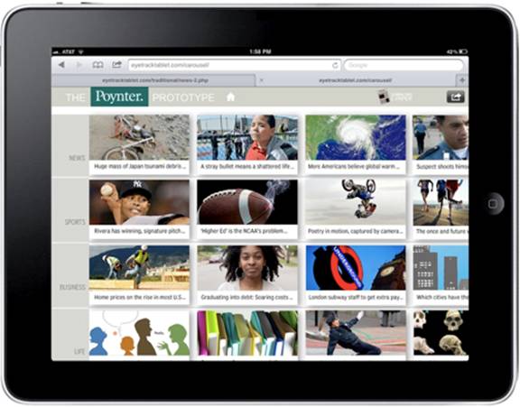
1. Carousel — 50% of study participants preferred this template.
Like NPR and Pulse, the carousel template offers an appetizing buffet of photos and headlines.
Downside: Because there’s no editorial hierarchy, this approach may be overwhelming.
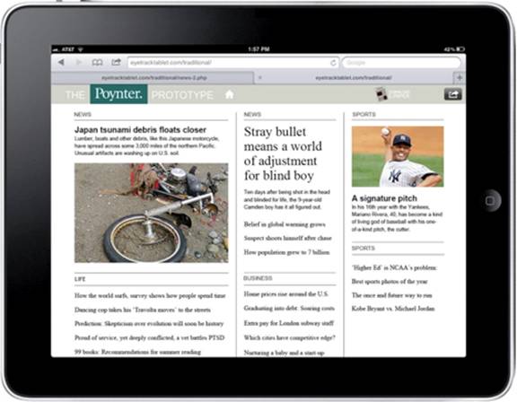
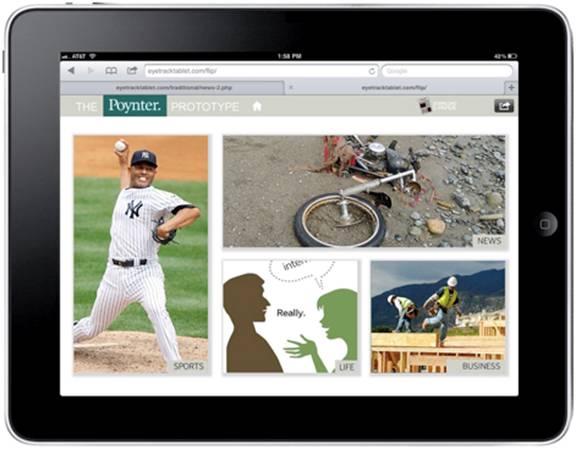
2. Traditional — 35% of study participants preferred this template.
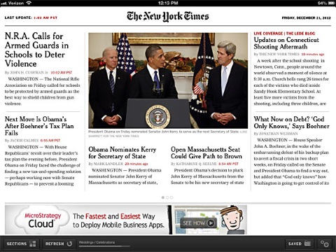
Like The Boston Globe and The New York Times, it offers a dominant photograph and lead headline, plus headlines for each of the other stories in the publication. Readers can find stories under four headings: news, sports, business and life.
Downside: Readers can’t see all the stories on offer.
3. Tile — 15% of study participants preferred this template. Like Flipboard, this template offers four images that highlighted one story from each category, but no headlines.
Downside: The lack of headlines made the stories in this template “mystery meat,” said one study participant.
Researchers felt that this design would have performed better — maybe best — if there had been headlines. “Marrying headlines to photos,” Garcia says, “that’s a glorious union.”
They shop; they buy. Study participants looked at 18 elements, on average, in the navigation before choosing the first story to read.
The more elements they reviewed before choosing, the further they read into the story. In fact, people who didn’t finish reading their first story looked at only nine items before choosing.
4. Design for swipers, not scrollers.
The current tablet design convention is to swipe to switch stories, scroll to read them. But participants in this study showed an overwhelmingly strong preference for swiping, at least in photo slide shows.
Participants handed an iPad in:
- Landscape orientation swiped 93% of the time
- Portrait orientation swiped 82% of the time
Garcia sees a movement toward design for swiping not only between but also within stories.
“Scrolling is so online,” he says, “so like 50 minutes ago.”
5. Think landscape, not portrait.
In exit interviews, participants expressed a strong preference for holding a tablet in horizontal, or landscape, orientation.
- 79% preferred landscape orientation
- 30% preferred portrait orientation
Why?
Because that’s the best way to watch videos, they said.
Best practice remains offering readers the chance to choose. But if you don’t have the resources to create apps in both modes, think landscape, not portrait, orientation.
6. Don’t get rid of ‘the chrome.’
Designers prefer to get rid of “the chrome,” the native navigation in browsers. Readers, on the other hand, prefer to use their browser buttons instead of navigational tools build into the content frame.
- 65% used “native controls” — the browser’s back button instead of the tools built into the content frame.
“This speaks to the importance of the familiarity of tools,” Quinn writes. “People will default to what they know if it’s available.”
7. Focus on photos and faces.
As with earlier eyetracking studies, people tended to enter a screen through a dominant element, generally a photograph. Faces in photographs and videos attracted a lot of attention.
8. Engage the finger.
Tablet design adds touch to the six key elements of electronic communication. Most people keep nearly constant contact with the screen.
- 61% of participants were intimate. That is, they kept their finger on the screen constantly — touching, tapping, pinching and swiping to adjust their view.
- 39% were detached. They carefully arranged a screenful of text before sitting back to read.
“Avoid the ‘frustrated finger’ when designing for tablets,” Garcia says. “Engage the finger as well as the brain and eyes.”
About the study
Using eyetracking gear, observation and exit interviews, Poynter watched 36 people interact for 90 seconds with real news stories on an iPad.
Participants looked at one of three prototypes for the project. Each prototype featured the same 20 stories but had different designs for the front page or entryway. Each story included a text narrative, plus a still photo, graphic, photo gallery, video or pop-up.
___
Sources: Sara Dickenson Quinn, David Stanton, Jeremy Gilbert and Mario Garcia; “EyeTrack: Tablet Research,” Poynter Institute conference session at the Medill School of Journalism at Northwestern University, Oct. 18, 2012
“Poynter Unveils Tablet Research Findings: Eyetracking Shows Direct Connection Between Storytelling Form and Engagement,” The Poynter Institute, Nov. 8, 2012
Sara Dickenson Quinn, “New Poynter Eyetrack research reveals how people read news on tablets,” Poynter.org, Oct. 17, 2012
Sara Dickenson Quinn, “Poynter ‘EyeTrack: Tablet’ research shows horizontal swiping instinct for photo galleries,” Poynter.org, May 4, 2012
Leave a Reply