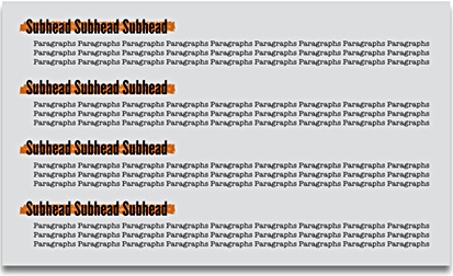
Show the parts with subheads
Think of subheads as the icing on the cake.

Skimmers look at subheads to learn what content you’re offering on a web page, blog post or news release. This creates the layer cake eye-gazing pattern — on an eyetracking heat map, it shows up as a series of horizontal lines.
That helps visitors find what they want quickly.
Without subheads to guide the way, web visitors either skim the first line (or less) of each paragraph in the F-shaped eye-gazing pattern or hunt around for individual words in the spotted pattern. Both of those are inefficient ways for skimmers to find what they want.

“By far, the single most important thing you can do to help users consume content is to use meaningful [subheads], and make [them] visually pop as compared to body text,” write Kara Pernice, Kathryn Whitenton and Jakob Nielsen, the authors of How People Read on the Web.
“The reader who sees the big parts is more likely to remember the whole story.”
— Roy Peter Clark, The Poynter Institute
Why subheads?
And no wonder. In addition to changing visitors’ eye-gazing patterns, good subheads can help you:
- Draw readers in. A compelling subhead can turn skimmers into readers.
- Help people find what they want quickly. Web visitors skim web pages, looking at subheads first to find sections of copy they’re looking for, before reading the paragraphs below.
- Break copy up. Good subheads break copy up into accessible, bite-sized chunks. And when your message looks easier to read, more people will read it.
- Keep readers reading. “Subheads increased reading for skimmers and for those whose attention was beginning to wane,” according to The Poynter Institute’s Eyetrack III study.
- Communicate to nonreaders. Well-written subheads can convey your key ideas to flippers, skimmers and others who won’t read your paragraphs, no matter what.
- Keep readers on your page. If they can’t find what they’re looking for on your page, they’re likely to go back to Google to find a page that gives them what they want.
- Help visitors read and understand. Subheads “make it vastly easier for users to read and understand web pages,” Pernice, et al., say.
- Make your message more memorable. “A writer who knows the big parts can name them for the reader” with subheads, writes Roy Peter Clark, senior scholar at The Poynter Institute. “The reader who sees the big parts is more likely to remember the whole story.”
Five more reasons for subheads
Indeed, any story of any significant length should have subheads, says Roy Peter Clark. Clark, The Poynter Institute’s editorial guru, says those subheads can:
- Create an index for the story
- Offer a distinctive point of entry into the piece
- Ventilate the gray page with white space
- Let the writer test the coherence of the piece
- Give the reader the global structure of the piece at a glance
This is a job for the writer, not the designer, Clark says. The writer should produce or at least suggest the subheads.
Don’t drop the subheads.
Whatever you do, don’t drop online subheads.
“If you are not calling out sections of your web pages or prose on those pages with subheads, you are making a big mistake!” write Pernice et al. “If you take nothing else [away], please take this: Use subheads and subsubheads.”
___
Source: Kara Pernice, Kathryn Whitenton and Jakob Nielsen; How People Read on the Web: The Eyetracking Evidence; Nielsen Norman Group; Sept. 10, 2013

Leave a Reply