And where is the fold, anyway?
“Instant gratification takes too long,” said Carrie Fisher, the late actress, author and wit.
When it comes to interacting with websites, she was certainly correct.
One Nielsen Norman Group study, for instance, found that people do like receiving email newsletters. But they want the subscription process to take — get this — less than zero seconds.
That’s what passes for instant enough on the web.
And that’s why it’s essential to put the most important information, including your call to action, above the fold of your web page.
What does ‘above the fold’ mean?
“Above the fold” has always meant the first screen of a web page. That’s the virtual equivalent of being on the top of the page — and that’s the front page — of a newspaper.
Research in the early days of web design showed that only 10% of web visitors scrolled, or looked below the first screen on a web page. But that was back when we had 14.4K modems and had never seen a scrollbar before.
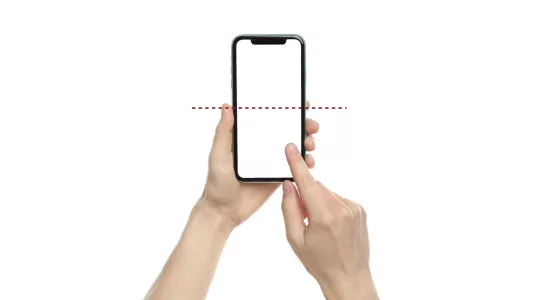
But now that more than half of your visitors are coming to your web page via their 3.5-x-6.5-inch smartphone screens, the fold placement has moved. (Screen resolution also determines where the fold appears to different web visitors.)
So why do people look so much more often at the top screen?
Blame interaction costs, writes Amy Schade, a researcher for the Nielsen Norman Group, in “The Fold Manifesto: Why the Page Fold Still Matters.”
Visitors can see the first screen without clicking — aka, paying an interaction cost. But they can see below the fold only if they scroll. And that’s an interaction cost.
So how much do they scroll?
How much do people scroll?
According to the Nielsen Norman Group, web visitors spend:
- 57% of their page-view time on the first screen
- 17% on the second
That means they spend:
- 74% on the first two screens
- 26% on all remaining screens
Screen size matters: That’s not much real estate. After all, content that shows up above the fold on a 30-inch monitor can take as many as 5 screens on a 3.5-x-6.5-inch smartphone.
Want to see higher conversion rates? Make sure your CTA appears on one of the top two mobile screens.
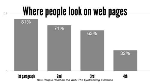
Here’s another way to look at it, according to Pernice et al. On a page with four or more paragraphs, visitors look at the:
- First paragraph: 81% of the time
- Second: 71% of the time
- Third: 63% of the time
- Fourth: 32% of the time
Same thing is true on search-results pages, according to the Nielsen Norman Group. Searchers sometimes look at only a single result if that first result meets their needs.
The result of this top-down reading approach online? The F-shaped gazing pattern.
F-shaped gazing pattern
Picture the way an old-fashioned typewriter carriage springs back to the left after each line.
That’s the F-shaped gazing pattern, write Kara Pernice, Kathryn Whitenton and Jakob Nielsen, the authors of How People Read on the Web.
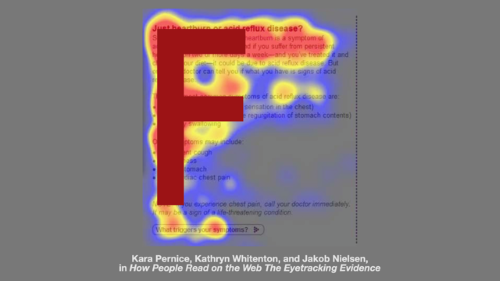
Web visitors read the first line of your content, then less and less of each line until they finally stop altogether. That creates the F-shaped eye-gazing pattern.
“F is for fast,” says usability guru Jakob Nielsen, who conducted the study. “That’s how users read your precious content. In a few seconds, their eyes move at amazing speeds across your website’s words in a pattern that’s very different from what you learned in school.”
How the F is formed. Visitors rely on visual signposts — subheads, bold-faced lead-ins, lists and the like — to decide what to read, skim or skip.
No signposts? No help. Then visitors have to create their own shortcuts.
One of those shortcuts is to skim in a path that forms the letter F. That is:
- First, website visitors read horizontally across the top of the content — the F’s top bar.
- Then they move down the page and read across in a second horizontal movement, usually shorter than the first. This is the F’s lower bar.
- Finally, they scan the left side of the content vertically — sometime slowly and systematically. This scan forms the F’s vertical bar.
If they can’t find what they’re looking for in the first few lines, they’re not likely to find a word or sentence buried in a large block of text further down the page. So they stop.
Which means that if you don’t write and design for F-shaped viewing, then F could be for fail.
Top and center
Location, location, location.
It’s as important in writing for mobile devices as it is for New York real estate.
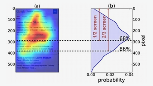
So think of the first screen on a smartphone as the $250 million Central Park South condo. And the penthouse? That’s the top half of the screen.
Readers devote 68% of their time and attention to the center and top half of the mobile screen and 86% to the upper two-thirds, according to a study by Briggsby.
So put your message where their eyes are: At the top of the top screen.
Put your key ideas above the fold.
To accommodate web visitors’ natural gazing patterns:
- Put the hot stuff up top: Pass the 1-2-3-4 test for the best user experience
- Offer a menu of content above the fold on websites: Tempt readers below the fold
- Weed out your web page above the fold: Don’t bury your message under sharing links, buttons, bylines and chrome
- Front-load your web copy: Focus on the first 2 words in headlines, and more
- Avoid false bottoms: They reduce reading in website design
- Put your CTA above the fold for conversion rate optimization
Most of all, write great content. Put the most interesting information at the top of the page, and visitors may decide to visit the bottom of the page as well.
“We don’t go to a page, see useless and irrelevant content, and scroll out of the blind hope that something useful may be hidden 5 screens down,” Schade writes. “What we find at the top of the page helps us decide to continue scrolling, navigate to another page, try another site, or abandon the task altogether.”
Learn more about where web visitors look:
- 6 eye-gaze patterns: How visitors look at your web page
- How to change eye-gaze patterns: Good writing, layout can make visitors read more
- Where they look on mobile: People gaze at the top half of their mobile screens
Source: Kara Pernice, Kathryn Whitenton, and Jakob Nielsen; How People Read on the Web: The Eyetracking Evidence; Nielsen Norman Group; Sept. 10, 2013

Leave a Reply