Don’t bury your message under sharing buttons, bylines and chrome
Web visitors spend 74% of their time on the first two screens, just 26% on all remaining screens, according to the Nielsen Norman Group

So once you’ve placed the most important elements above the fold, the next step is to weed out anything that’s pushing those key elements down the page.
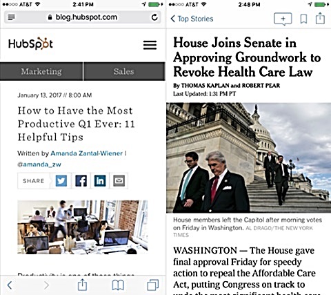
Take Hubspot’s marketing blog. Above the fold, we have:
- The HubSpot flag and menu
- Marketing a sales tabs
- Publication date
- A three-line headline
- A two-line byline, including the writer’s Twitter handle
- Sharing buttons
- A busy image without a caption

What we don’t see? A single word of the article itself.
The New York Times app, on the other hand, squeezes a three-line headline, a telling photo, a caption that adds information and four lines of the lead onto the first screen.
So what can you move from the top screen?
- Bylines. Only the writer and the writer’s mother care who wrote the piece.
- Publication dates. “The story date is not worth the substantial screen real estate it occupies,” writes usability expert Jakob Nielsen.
- Categories, tags and sharing buttons. They don’t add helpful information.
- Chrome, or buttons, navigation, menus and other design elements. “Prioritize content over chrome” on mobile, Nielsen counsels.
Because when it comes to making the web page tops, what you take off the first screen is as important as what you put in.
Bottom line: Display more content at the top.
_____

Leave a Reply