BBC’s heads are short, clear, front-loaded and context-free
Who writes the world’s best web heads?

The folks at BBC News, according to usability expert Jakob Nielsen. Nielsen points to these effective headlines:
Italy buries first quake victims
Romania blamed over Moldova riots
Iran accuses journalist of spying
Ten arrested in UK anti-terrorism raids
Villagers hurt in West Bank clash
Mass Thai protest over leadership
“Around the world in 38 words,” Nielsen says.
How can you write great headlines like the BBC’s? Make sure your blog-post, content-marketing, social-media and other digital-marketing headlines are:
1. Context-free.
Microcontent moves: Web headlines are likely to show up alone in indexes, on social media and in search engine results.
“If there is a choice between boring and useless, I suggest going for boring.”
— Steffen Fjaervik, contributing writer for Poynter Online
That means your headlines and other online display copy — aka microcontent — must be clear regardless of whether the reader sees them within the context of the original page.
Take this headline:
On the move
In print, readers would get a clue about what that means from, say, mugshots of successful employees, images of a moving van or a picture of a shiny new skyscraper. But on a Google search results page or another index, readers might not be able to figure out whether this piece of content is:
- A story about employee promotions
- A piece on your company’s relocation benefits
- Or an article about the new headquarters building
Can readers understand your headlines — without the supporting text, illustrations and other microcontent that appeared on the original web page? If they can’t tell, chances are, they won’t click.
Good microcontent is easy to understand wherever it shows up, in or out of context. So write web headlines that are ready to move.
2. Clear.
One job of the headline is to get web visitors to read your web page. But even the most catchy headline rarely gets that job done.
That’s because few web visitors read online paragraphs in detail. Mostly, web visitors skim and scan the headlines and other display copy. So if you want them to know something, put it in the display copy.
So tell the story — don’t tell about the story — in the headline.
Some types of headlines tell about the story. Here’s one:
Moves and milestones
Who’s moving? What milestones?
This headline tells the story:
Phil Smith named product manager, Program Development
This online business headline tells about the story:
Benefits changes announced
What’s changed?
This headline tells the story:
Hallmark doubles profit sharing contribution
This headline tells about the story:
New survey tracks industry trends
What did you learn in the survey?
This headline tells the story:
More communicators measuring ROI, survey says
3. Not clever.
I love clever headlines in print. But funny headlines don’t work well online.
Why? See context-free, above. And because Google never laughs.
Instead, make your headlines and other microcontent explanatory.
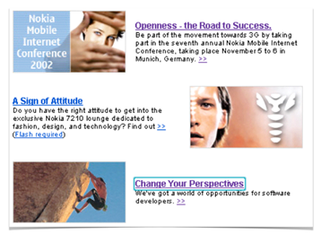
One huge telecomm company’s website features marketing headlines such as:
Openness — the road to success
(a conference)
A sign of attitude
(cool phones)
Change your perspectives
( IT jobs)
If you’re writing about conferences, phones and jobs, the words conference, phone and job should appear in good headlines.
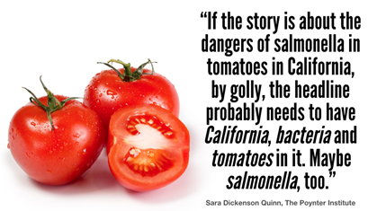
“If the story is about the dangers of salmonella in tomatoes in California, by golly, the headline probably needs to have California, bacteria and tomatoes in it,” writes Sara Dickenson Quinn, visual journalism guru at The Poynter Institute.
“Maybe salmonella, too.”
The point here is to communicate, not to intrigue. So strive for clarity instead of creativity. Help visitors find what they’re looking for with headlines that explain rather than entertain.
As the BBC writes: Italy buries first quake victims. Any questions?
4. Front-loaded.
When viewing a list of articles on a search engine results page or an index page, web visitors spend less than one second looking at headlines. That’s according to Eyetrack III, a study of online behavior by The Poynter Institute.
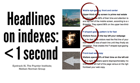
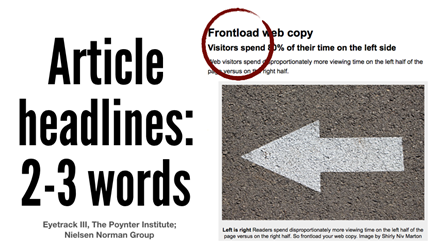
So focus on the front, or on the first 2 words — 11 characters — of the headline.
To do so:
- Make it a mullet — business upfront, party in the back. Just slide the topic word to the front and put a colon after it.
No (first 11 characters highlighted):
Use drop-down menus sparingly
Yes:
Drop-down menus: Use sparingly
Bonus: Adding a colon or hyphen to your headline can boost results by 9%, according to the Content Marketing Institute.
- Use numerals to say more with fewer characters.
Instead of:
First two words: A signal for the scanning eye
Nielsen recommends that you make it:
First 2 words: A signal for the scanning eye
Remember, it’s long been AP style to use numerals for all numbers, even 1 through 9, in headlines.
Bonus: 36% of people prefer list-based headlines, according to ConversionXL. So make numbers count.
Oddly, list posts with odd numbers in the headlines outperformed those with even ones by 20%, according to the Content Marketing Institute. So 7 steps is better than 10 tips.
- Move your organization’s name to the end. Check your newsroom: When you scan the list of news release headlines and links, what’s the first word in each item?
Is it the topic word? Or do you have a list of items that each begins “XYZ Organization announces …”
No:
Drake University campus life
Yes:
Campus life at Drake University
Front-load like the BBC. How do the BBC’s headlines stack up? Here are the first 2 words from each headline on Nielsen’s list:
Italy buries
Romania blamed
Ten arrested
Villagers hurt
Mass Thai
Iran accuses
Any questions?
5. Short.
Not everyone wants to play, “What’s the last word in the headline?” says Andy Bechtel, associate professor, School of Journalism and Mass Communication at UNC-Chapel Hill.
So write web heads that don’t get truncated by Google, social media channels, mobile apps — or your reader’s attention.
Don’t get your head cut off by:
- To avoid having your headline truncated on search engine results pages, keep headlines to 55 characters or fewer. For SEO, Google prefers that you write headlines with at least 5 words.
- Social media. How will your headline look when it shows up on Facebook, Twitter and other social sharing sites? To avoid getting your head cut off on social media, aim for 55 characters or less.
- Mobile. Mobile apps and websites often truncate long headlines. To avoid getting your head cut off on mobile apps, follow the Associated Press’s guideline and limit headlines to fewer than 40 characters.
- Keep your web head to 8 words or fewer, or about 40 characters. That’s the length readers can understand at a glance, according to research by The American Press Institute. Bonus: Editing down your headline to 8 words can result in a 21% boost in clickthrough rates, according to the Content Marketing Institute.
But online, shorter’s better. My personal preference is for web heads of 6 words or less, or about 30 characters. The average BBC head that made Nielsen’s list weighs in at five words, or 34 characters.
However, note that headlines that work for blog posts tend to be longer, according to Hubspot. Once you write a great post, top it with a headline of 6 to 13 words for the most consistent boost in traffic and hits.
Consider BBC style
The BBC itself offers these suggestions for headlines that make readers feel compelled to click:
- Write two headlines: a short one for search engine results pages and other indexes and a longer line for search engine optimization. No doubt about it: Google rules online headlines.
- Think news style. Follow these do’s and don’ts:
- DO include a verb, most of the time: “Britain’s top policeman resigns.”
- DON’T use journalese: “Cave yields marsupial fossil haul.”
- DON’T be ambiguous: “Queen sells pirate music to fans”
- Tell the story. “You need a short header that is factual and gives understanding,” writes BBC mobile editor Nathalie Malinarich. “Otherwise it just becomes click bait.”
Tweak those headlines.
I once talked to a VP of communications for Humana who asked his communicators to spend 90% of their time and effort on the headlines and other display copy and 10% on the paragraphs.
I’m not sure about the proportions, but I agree with the sentiment. The investment you make in polishing the headline will pay off: Headline tweaks can boost clicks by 10%, according to a study by MarketingExperiments.
As the great adman David Ogilvy wrote: “By the time you’ve written your headline, you’ve spent 90 cents of your advertising dollar.”
Are you investing it well?
[sc name=”mc-cyr-liotp”]____
Sources: “Writing for mobile: Bite-size basics,” BBC Academy, Dec. 2, 2014
“Writing for the web,” BBC Academy, July 2, 2013
Jakob Nielsen, “World’s Best Headlines: BBC News,” Alertbox, April 27, 2009 [1]
Jodi Harris, “Increase Content Marketing Success With Helpful Headline Tips & Tools,” Content Marketing Institute, Aug. 18, 2015
Neil Patel, “5 Characteristics Of High Converting Headlines,” Conversion XL, July 8, 2014
Mimi An, “Compounding Blog Posts: What They Are and Why They Matter,” Hubspot, Jan. 28, 2016
Hi Lovers! Sorry, but we know nothing about dating profile headlines. We wish you the best with online dating and hope you are traveling the world with a new love on June 26, but we can’t help you with that. Thanks for looking!

Leave a Reply